Applied Examples: Monthly vs Quarterly Labor Market Analysis
Source:vignettes/applied-examples.Rmd
applied-examples.RmdIntroduction
Brazil’s Continuous National Household Sample Survey (PNADC) publishes quarterly and annual microdata for official labor market statistics. However, these quarterly statistics are actually an average of three-month phenomena—the SIDRA monthly series are rolling averages, not true monthly snapshots. This quarterly averaging obscures the timing and magnitude of economic shocks and blurs the detection of turning points.
The PNADCperiods package solves this by identifying
which specific month each interview refers to, using birthday
information and IBGE’s interview scheduling rules. With the full PNADC
history (2012-2025), the algorithm achieves a ~97% determination
rate for monthly identification.
This vignette demonstrates three cases where monthly data reveals dynamics that quarterly data hides, culminating in a powerful validation using minimum wage transitions.
Working with poverty or income data? See Monthly Poverty Analysis with Annual PNADC Data.
Prerequisites
To reproduce these analyses, you need stacked PNADC microdata spanning multiple quarters. See Download and Prepare Data for data preparation, or Get Started for basic usage.
# Load required packages
library(PNADCperiods)
library(data.table)
library(ggplot2)
library(scales)
Preparing the Data
This section shows how to create the aggregate time series used in the examples below.
Step 1: Load and Mensalize Your Data
# Load your stacked PNADC data (see download-and-prepare vignette)
library(fst)
pnadc <- read_fst("path/to/your/pnadc_stacked.fst", as.data.table = TRUE)

# Build crosswalk (identify reference periods)
crosswalk <- pnadc_identify_periods(pnadc, verbose = TRUE)

# Keep a clean copy for sub-monthly calibration later (Section 4)
pnadc_clean <- copy(pnadc)

# Apply crosswalk with weight calibration
pnadc <- pnadc_apply_periods(
  pnadc,
  crosswalk,
  weight_var = "V1028",
  anchor = "quarter",
  calibrate = TRUE
)
Step 2: Create Labor Market Variables
# Filter to working-age population (14+)
pnadc <- pnadc[V2009 >= 14]

# Create labor market indicators
pnadc[, `:=`(
  # PEA: Economically Active Population (VD4001 == 1)
  pea = fifelse(VD4001 == 1, 1L, 0L),

  # Employed (VD4002 == 1)
  employed = fifelse(VD4002 == 1, 1L, 0L),

  # Unemployed (in labor force but not employed)
  unemployed = fifelse(VD4002 == 2, 1L, 0L)
)]

# Formality indicator (among employed)
# Formal: positions 1,3,5,7 OR positions 8,9 with social security contribution
pnadc[, formal := fifelse(
  VD4009 %in% c(1L, 3L, 5L, 7L), 1L,
  fifelse(VD4009 %in% c(8L, 9L) & VD4012 == 1L, 1L, 0L)
)]
pnadc[VD4002 != 1, formal := NA_integer_]
Step 3: Create Quarterly Series
Quarterly aggregates use the original IBGE weight
(V1028):
quarterly_total <- pnadc[, .(
  unemployment_rate = sum(unemployed * V1028, na.rm = TRUE) /
                      sum(pea * V1028, na.rm = TRUE),
  participation_rate = sum(pea * V1028, na.rm = TRUE) /
                       sum(V1028, na.rm = TRUE),
  formalization_rate = sum(formal * V1028, na.rm = TRUE) /
                       sum(employed * V1028, na.rm = TRUE)
), by = .(Ano, Trimestre)]

# Add period column for plotting (mid-quarter date)
quarterly_total[, period := as.Date(paste0(Ano, "-", (Trimestre - 1) * 3 + 2, "-15"))]
Step 4: Create Monthly Series
Monthly aggregates use weight_monthly from
PNADCperiods:
# Filter to observations with determined reference month
pnadc_monthly <- pnadc[!is.na(weight_monthly)]

monthly_total <- pnadc_monthly[, .(
  unemployment_rate = sum(unemployed * weight_monthly, na.rm = TRUE) /
                      sum(pea * weight_monthly, na.rm = TRUE),
  participation_rate = sum(pea * weight_monthly, na.rm = TRUE) /
                       sum(weight_monthly, na.rm = TRUE),
  formalization_rate = sum(formal * weight_monthly, na.rm = TRUE) /
                       sum(employed * weight_monthly, na.rm = TRUE)
), by = ref_month_yyyymm]

# Add period column for plotting (mid-month date)
monthly_total[, period := as.Date(paste0(
  ref_month_yyyymm %/% 100, "-",
  ref_month_yyyymm %% 100, "-15"
))]
With these objects created, you can now run all the examples below.
1. COVID-19 Unemployment: The True Peak
The COVID-19 pandemic caused the sharpest labor market shock in Brazilian history. Quarterly data couldn’t tell policymakers exactly when the crisis peaked or how severe it truly was—information critical for calibrating emergency responses like unemployment benefits and business support.
Show plotting code
# Filter to COVID period (Oct 2019 - Jan 2022)
covid_quarterly <- quarterly_total[period >= "2019-10-01" & period <= "2022-01-01"]
covid_monthly <- monthly_total[period >= "2019-10-01" & period <= "2022-01-01"]

# Find the unemployment peaks
peak_quarterly <- covid_quarterly[which.max(unemployment_rate)]
peak_monthly <- covid_monthly[which.max(unemployment_rate)]

# Create the comparison plot
ggplot() +
  # Quarterly as step function (emphasizes moving-average nature)
  geom_step(data = covid_quarterly,
            aes(x = period, y = unemployment_rate),
            color = "steelblue", linewidth = 1.2, direction = "mid") +
  geom_point(data = covid_quarterly,
             aes(x = period, y = unemployment_rate),
             color = "steelblue", size = 3) +

  # Monthly as line
  geom_line(data = covid_monthly,
            aes(x = period, y = unemployment_rate),
            color = "darkred", linewidth = 0.9) +
  geom_point(data = covid_monthly,
             aes(x = period, y = unemployment_rate),
             color = "darkred", size = 1.5) +

  # Annotate monthly peak
  annotate("segment",
           x = peak_monthly$period, xend = peak_monthly$period,
           y = peak_monthly$unemployment_rate + 0.005,
           yend = peak_monthly$unemployment_rate + 0.02,
           arrow = arrow(length = unit(0.2, "cm")), color = "darkred") +
  annotate("text",
           x = peak_monthly$period,
           y = peak_monthly$unemployment_rate + 0.022,
           label = paste0("Monthly peak: ", format(peak_monthly$period, "%b %Y"), "\n",
                         sprintf("%.1f%%", peak_monthly$unemployment_rate * 100)),
           size = 3.2, color = "darkred", hjust = 0.5) +

  # Annotate quarterly peak
  annotate("segment",
           x = peak_quarterly$period + 30, xend = peak_quarterly$period + 30,
           y = peak_quarterly$unemployment_rate - 0.005,
           yend = peak_quarterly$unemployment_rate - 0.02,
           arrow = arrow(length = unit(0.2, "cm")), color = "steelblue") +
  annotate("text",
           x = peak_quarterly$period + 30,
           y = peak_quarterly$unemployment_rate - 0.025,
           label = paste0("Quarterly peak: ", format(peak_quarterly$period, "%b %Y"), "\n",
                         sprintf("%.1f%%", peak_quarterly$unemployment_rate * 100)),
           size = 3.2, color = "steelblue", hjust = 0.5) +

  # Scales and labels
  scale_y_continuous(labels = percent_format(accuracy = 0.1),
                     limits = c(0.10, 0.17)) +
  scale_x_date(date_breaks = "3 months", date_labels = "%b\n%Y") +
  labs(
    title = "COVID-19 Unemployment Spike: Monthly vs Quarterly",
    subtitle = "Monthly data (red) shows the true peak; quarterly (blue) averages it away",
    x = NULL, y = "Unemployment Rate",
    caption = "Source: PNADC/IBGE. Quarterly shown as step function to emphasize moving-average nature."
  ) +
  theme_minimal(base_size = 11) +
  theme(
    plot.title = element_text(face = "bold"),
    panel.grid.minor = element_blank()
  )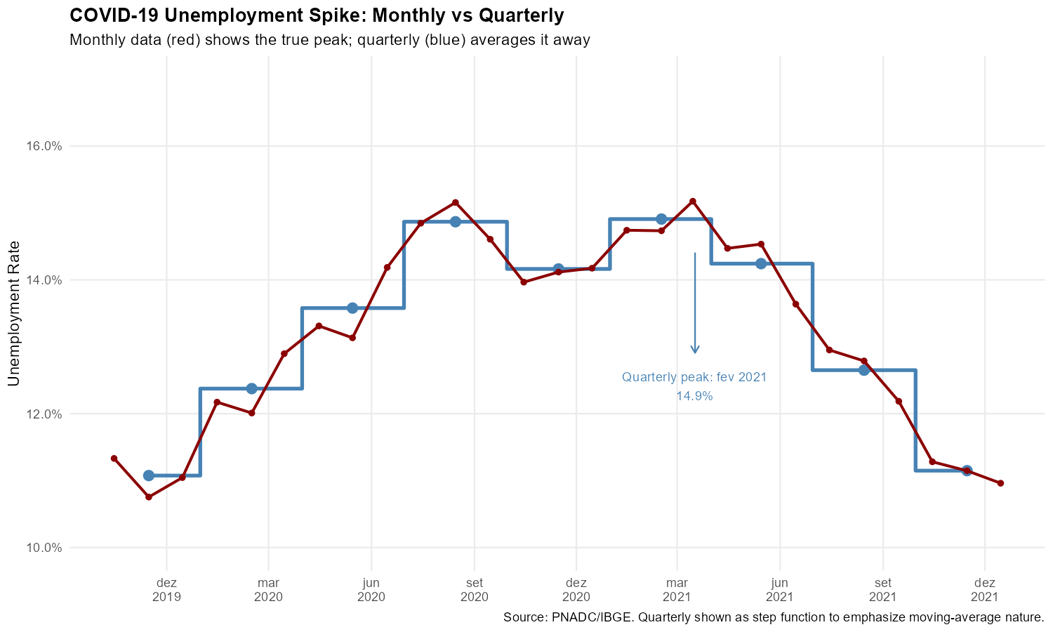
The monthly series reveals that unemployment peaked roughly 2 percentage points higher than the quarterly data suggests, and the timing of the peak is more precisely identified.
2. The 2014-2017 Recession: Tracking Month-by-Month Deterioration
Brazil’s 2014-2017 recession saw unemployment rise from around 6% to over 13%. Monthly data reveals this deterioration unfolded in fits and starts, with several months showing unemployment increases exceeding 1 percentage point—sudden shocks invisible in the averaged quarterly figures.
Show plotting code
# Filter to recession period (Jun 2014 - Jun 2017)
recession_quarterly <- quarterly_total[period >= "2014-06-01" & period <= "2017-06-01"]
recession_monthly <- monthly_total[period >= "2014-06-01" & period <= "2017-06-01"]

# Find the peak
peak_recession <- recession_monthly[which.max(unemployment_rate)]

# Calculate month-over-month changes
setorder(recession_monthly, period)
recession_monthly[, change := unemployment_rate - shift(unemployment_rate)]

# Identify months with large jumps (> 1 percentage point)
big_jumps <- recession_monthly[!is.na(change) & change > 0.01]

# Create the plot
ggplot() +
  # Quarterly
  geom_step(data = recession_quarterly,
            aes(x = period, y = unemployment_rate),
            color = "steelblue", linewidth = 1, direction = "mid", alpha = 0.7) +
  geom_point(data = recession_quarterly,
             aes(x = period, y = unemployment_rate),
             color = "steelblue", size = 2.5) +

  # Monthly
  geom_line(data = recession_monthly,
            aes(x = period, y = unemployment_rate),
            color = "darkred", linewidth = 0.8) +
  geom_point(data = recession_monthly,
             aes(x = period, y = unemployment_rate),
             color = "darkred", size = 1.2) +

  # Highlight big monthly jumps
  geom_point(data = big_jumps,
             aes(x = period, y = unemployment_rate),
             color = "darkred", size = 3, shape = 21, fill = "yellow", stroke = 1.5) +

  # Mark the peak
  annotate("point", x = peak_recession$period, y = peak_recession$unemployment_rate,
           color = "darkred", size = 4, shape = 18) +
  annotate("text",
           x = peak_recession$period + 45, y = peak_recession$unemployment_rate,
           label = paste0("Peak: ", format(peak_recession$period, "%b %Y"), "\n",
                         sprintf("%.1f%%", peak_recession$unemployment_rate * 100)),
           size = 3, hjust = 0, color = "darkred") +

  # Scales and labels
  scale_y_continuous(labels = percent_format(accuracy = 1),
                     breaks = seq(0.06, 0.14, 0.02)) +
  scale_x_date(date_breaks = "6 months", date_labels = "%b\n%Y") +
  labs(
    title = "2014-2017 Recession: Month-by-Month Unemployment Rise",
    subtitle = "Yellow circles: months with >1 p.p. unemployment increase. Monthly data (red) vs quarterly (blue).",
    x = NULL, y = "Unemployment Rate",
    caption = "Source: PNADC/IBGE. Monthly data reveals sudden jumps hidden in quarterly averages."
  ) +
  theme_minimal(base_size = 11) +
  theme(
    plot.title = element_text(face = "bold"),
    panel.grid.minor = element_blank()
  )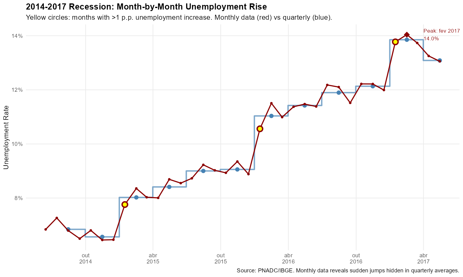
The yellow circles mark months where unemployment jumped by more than 1 percentage point: sudden deteriorations that are completely invisible in the smooth quarterly trend.
3. Minimum Wage Adjustments: Validating Mensalization
Perhaps the most compelling validation of the mensalization methodology comes from tracking minimum wage adjustments. PNADC collects two income measures:
- Habitual income (VD4016): What the worker usually earns—refers to the current reference month
- Effective income (VD4017): What the worker actually received—refers to the previous month
When the minimum wage increases (typically in January), habitual income should show the new value immediately, while effective income should still show the old value (since it refers to the previous month). This one-month lag is a prediction of our mensalization: if reference month identification is correct, the pattern is crisp; if wrong, it blurs.
We focus on formal private sector employees (VD4009 == 1) aged 18+, tracking the share earning exactly each historical minimum wage value.
Preparing the Minimum Wage Data
# Historical minimum wage values (R$)
# Note: 2020 had two adjustments (Jan and Feb), 2023 had mid-year adjustment (May)
mw_history <- data.table(
  start_yyyymm = c(201201, 201301, 201401, 201501, 201601, 201701, 201801,
                   201901, 202001, 202002, 202101, 202201, 202301, 202305,
                   202401, 202501),
  mw_value = c(622, 678, 724, 788, 880, 937, 954, 998, 1039, 1045, 1100,
               1212, 1302, 1320, 1412, 1518)
)
mw_adjustment_months <- mw_history$start_yyyymm

# For each formal private sector employee, identify which MW they earn
pnadc_formal <- pnadc[VD4009 == 1 & V2009 >= 18 & !is.na(weight_monthly)]

# Match exact habitual/effective incomes to MW values
pnadc_formal[, habitual_mw := mw_history[start_yyyymm <= ref_month_yyyymm][.N, mw_value], by = ref_month_yyyymm]
pnadc_formal[, at_habitual_mw := as.integer(VD4016 == habitual_mw)]
pnadc_formal[, at_effective_mw := as.integer(VD4017 == habitual_mw)]

# Aggregate by month and MW value
monthly_mw_exact <- pnadc_formal[, .(
  n_workers = sum(weight_monthly),
  pct_habitual = sum(at_habitual_mw * weight_monthly) / sum(weight_monthly),
  pct_effective = sum(at_effective_mw * weight_monthly) / sum(weight_monthly)
), by = .(ref_month_yyyymm, mw_value = habitual_mw)]

monthly_mw_exact[, period := as.Date(paste0(ref_month_yyyymm %/% 100, "-",
                                             ref_month_yyyymm %% 100, "-15"))]
The Smoking Gun: January 2013 Transition
In January 2013, the minimum wage increased from R$ 622 to R$ 678:
Show plotting code
# Create long format for plotting (needed for all MW examples)
mw_long <- melt(monthly_mw_exact,
                id.vars = c("ref_month_yyyymm", "period", "mw_value", "n_workers"),
                measure.vars = c("pct_habitual", "pct_effective"),
                variable.name = "income_type",
                value.name = "pct_at_mw")

# Add readable labels
mw_long[, income_label := fifelse(income_type == "pct_habitual",
                                   "Habitual Income (current month)",
                                   "Effective Income (previous month)")]

# Get adjustment dates for reference lines
adj_dates <- as.Date(paste0(mw_adjustment_months %/% 100, "-",
                             mw_adjustment_months %% 100, "-15"))

# Filter to the first transition period (Oct 2012 - Apr 2013)
mw_2013 <- mw_long[period >= "2012-10-15" & period <= "2013-04-15" &
                   mw_value %in% c(622, 678)]

# Create the plot
ggplot(mw_2013,
       aes(x = period, y = pct_at_mw, color = factor(mw_value), linetype = factor(mw_value))) +
  geom_line(linewidth = 1.2) +
  geom_point(size = 2.5) +

  # Mark the adjustment date (January 2013)
  geom_vline(xintercept = as.Date("2013-01-15"),
             linetype = "dashed", linewidth = 0.8, color = "gray40") +

  # Facet by income type
  facet_wrap(~ income_label, ncol = 2) +

  # Scales and labels
  scale_y_continuous(labels = percent_format(accuracy = 0.1)) +
  scale_x_date(date_breaks = "1 month", date_labels = "%b\n%Y") +
  scale_color_manual(values = c("622" = "#b2182b", "678" = "#2166ac"),
                     labels = c("622" = "R$ 622 (old)", "678" = "R$ 678 (new)"),
                     name = "MW Value") +
  scale_linetype_manual(values = c("622" = "solid", "678" = "solid"), guide = "none") +
  labs(
    title = "MW Transition: January 2013 (R$ 622 -> R$ 678)",
    subtitle = "Habitual income shows transition in January; Effective income shows same pattern in February",
    x = NULL, y = "Share Earning Exact MW",
    caption = "Vertical line = MW adjustment. Habitual income refers to current month; effective to previous month."
  ) +
  theme_minimal(base_size = 11) +
  theme(
    plot.title = element_text(face = "bold"),
    legend.position = "bottom",
    panel.grid.minor = element_blank(),
    strip.text = element_text(face = "bold")
  )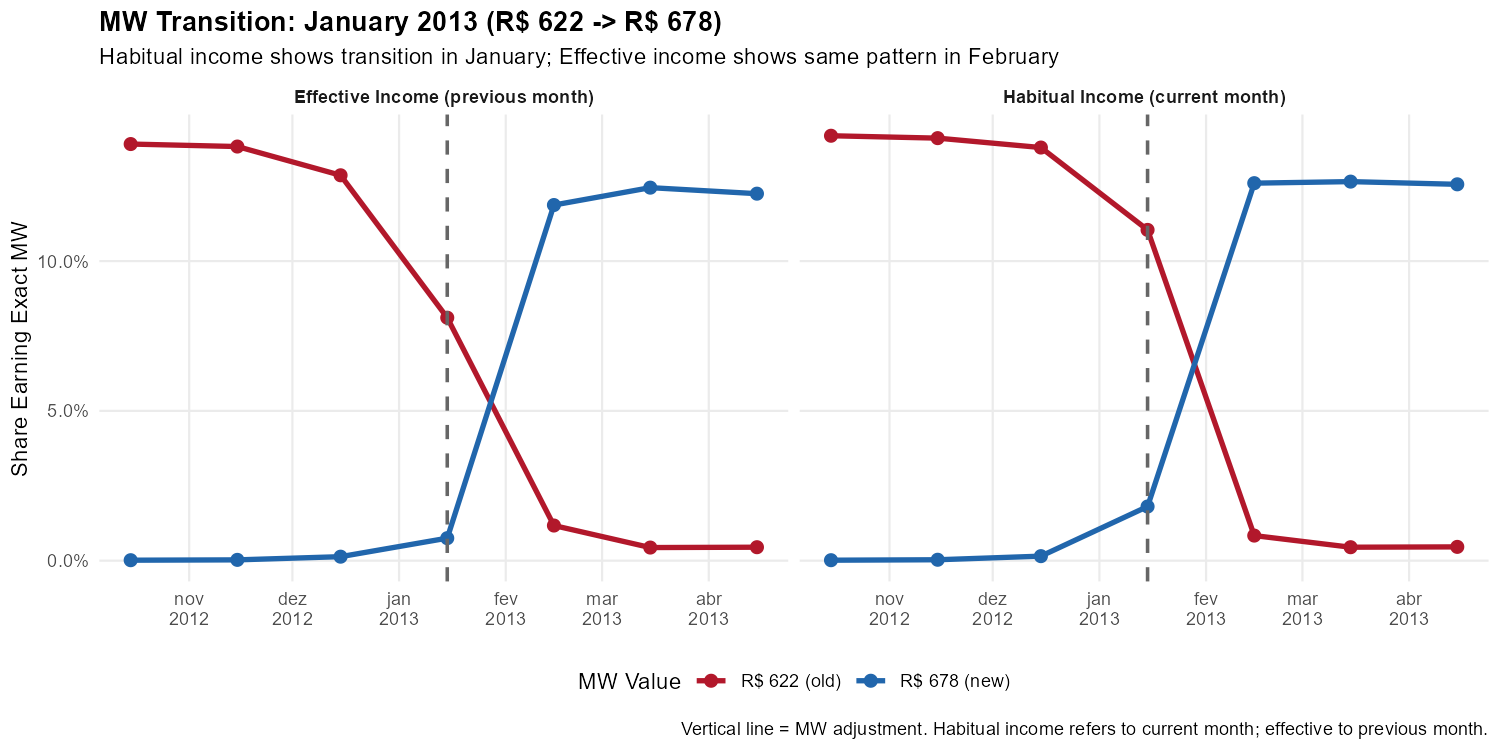
This is the smoking gun. In the left panel (habitual income), workers shift from R$ 622 to R$ 678 in January. In the right panel (effective income), the same shift happens in February—exactly the one-month lag predicted by the temporal reference of each variable.
A Harder Test: The 2020 Double Adjustment
In an unusual sequence, Brazil adjusted the minimum wage twice in consecutive months:
- January 2020: R$ 998 -> R$ 1,039 (annual adjustment)
- February 2020: R$ 1,039 -> R$ 1,045 (correction)
R$ 1,039 was the official minimum wage for only one month. If our reference month identification were imprecise, these rapid transitions would blur together.
Show plotting code
# Filter to 2020 double adjustment period (Jul 2019 - Jul 2020)
mw_2020 <- mw_long[period >= "2019-07-15" & period <= "2020-07-15" &
                   mw_value %in% c(998, 1039, 1045)]

# Get adjustment dates in this period
adj_2020 <- adj_dates[adj_dates >= "2019-07-15" & adj_dates <= "2020-07-15"]

# Create the plot
ggplot(mw_2020,
       aes(x = period, y = pct_at_mw, color = factor(mw_value), linetype = factor(mw_value))) +
  geom_line(linewidth = 1.1) +
  geom_point(size = 2.5) +

  # Mark adjustment months
  geom_vline(xintercept = adj_2020, linetype = "dashed", linewidth = 0.8, color = "gray40") +

  # Facet by income type
  facet_wrap(~ income_label, ncol = 2) +

  # Scales and labels
  scale_y_continuous(labels = percent_format(accuracy = 0.1)) +
  scale_x_date(date_breaks = "1 month", date_labels = "%b\n%Y") +
  scale_color_manual(values = c("998" = "#b2182b", "1039" = "#7b3294", "1045" = "#2166ac"),
                     labels = c("998" = "R$ 998 (2019)", "1039" = "R$ 1,039 (Jan 2020)",
                               "1045" = "R$ 1,045 (Feb 2020+)"),
                     name = "MW Value") +
  scale_linetype_manual(values = c("998" = "solid", "1039" = "solid", "1045" = "solid"),
                        guide = "none") +
  labs(
    title = "The 2020 Double Adjustment: A Demanding Test",
    subtitle = "R$ 998 -> R$ 1,039 (Jan) -> R$ 1,045 (Feb). Three values, two transitions, one-month lag preserved.",
    x = NULL, y = "Share Earning Exact MW",
    caption = "Vertical lines = MW adjustments. The short-lived R$ 1,039 value (one month only) creates a sharp test."
  ) +
  theme_minimal(base_size = 11) +
  theme(
    plot.title = element_text(face = "bold"),
    legend.position = "bottom",
    panel.grid.minor = element_blank(),
    strip.text = element_text(face = "bold")
  )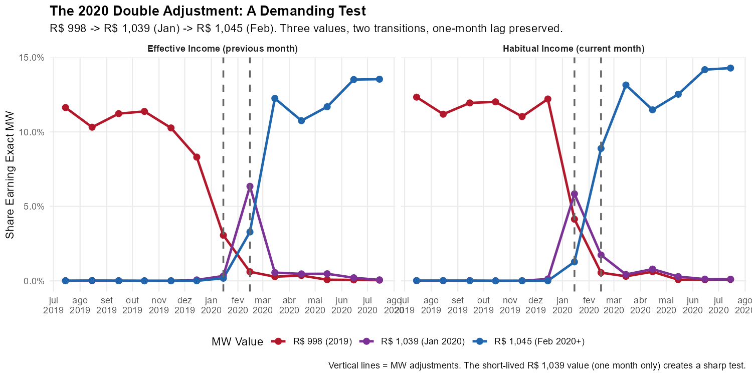
The pattern remains crisp. In habitual income, January shows R$ 1,039 replacing R$ 998, and February shows R$ 1,045 replacing R$ 1,039. In effective income, each transition appears exactly one month later.
The Full Picture: 2012-2025
Show plotting code
# Create color palette (blue to red gradient)
mw_vals <- sort(unique(monthly_mw_exact$mw_value))
n_mw <- length(mw_vals)
palette_fn <- colorRampPalette(c("#2166ac", "#67a9cf", "#d1e5f0",
                                  "#fddbc7", "#ef8a62", "#b2182b"))
mw_colors <- palette_fn(n_mw)
names(mw_colors) <- as.character(mw_vals)

# Filter to MW values with meaningful presence (>0.1% at some point)
mw_long[, max_pct := max(pct_at_mw), by = mw_value]
mw_long_filtered <- mw_long[max_pct > 0.001]

# Create the plot
ggplot(mw_long_filtered,
       aes(x = period, y = pct_at_mw, color = factor(mw_value), group = mw_value)) +
  geom_line(linewidth = 0.6, alpha = 0.8) +

  # Mark MW adjustment months
  geom_vline(xintercept = adj_dates, linetype = "dashed", alpha = 0.3, color = "gray40") +

  # Facet by income type
  facet_wrap(~ income_label, ncol = 1) +

  # Scales and labels
  scale_y_continuous(labels = percent_format(accuracy = 0.1)) +
  scale_x_date(date_breaks = "1 year", date_labels = "%Y") +
  scale_color_manual(values = mw_colors, name = "MW Value (R$)") +
  labs(
    title = "Share of Formal Workers Earning Each Exact MW Value",
    subtitle = "Each line = one MW value. Vertical lines = MW adjustments. Pattern shifted 1 month between panels.",
    x = NULL, y = "Share of Workers",
    caption = "Source: PNADC/IBGE. Formal private sector employees age 18+. All calculations use weight_monthly."
  ) +
  theme_minimal(base_size = 11) +
  theme(
    plot.title = element_text(face = "bold"),
    legend.position = "right",
    legend.key.size = unit(0.4, "cm"),
    panel.grid.minor = element_blank(),
    strip.text = element_text(face = "bold", size = 11)
  ) +
  guides(color = guide_legend(ncol = 2))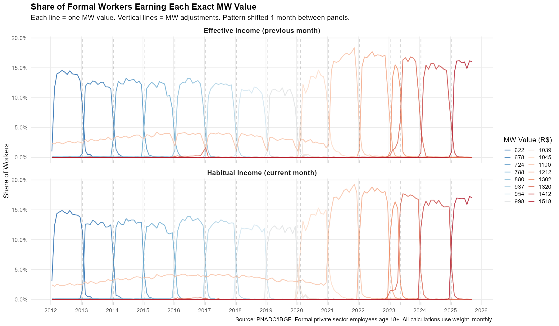
Each vertical line marks a MW adjustment. The pattern in the top panel (habitual income) is shifted one month earlier than the bottom panel (effective income)—consistently across thirteen years and sixteen minimum wage values. This provides strong validation that the mensalization algorithm correctly identifies reference months.
Summary: What Monthly Data Reveals
| Analysis | Quarterly Limitation | Monthly Insight |
|---|---|---|
| COVID unemployment | Peak understated | True peak ~2 p.p. higher |
| Recession tracking | Appears as smooth climb | Multiple months with >1 p.p. jumps |
| Minimum wage | Timing impossible | 1-month lag validates methodology |
Monthly data from PNADCperiods enables precise
timing of economic turning points, true
magnitudes of shocks, and validation through
known temporal patterns.
4. Beyond Monthly: Fortnightly and Weekly Analysis
PNADCperiods also identifies
fortnightly and weekly reference
periods. These have lower determination rates because, unlike months
(which aggregate constraints across quarterly visits), fortnights and
weeks can only use information from within a single quarter.
Determination Rates and Experimental Strategies
| Granularity | Strict Rate | Experimental Rate | Improvement |
|---|---|---|---|
| Monthly | ~97% | – | – |
| Fortnightly | ~8% | ~12% | ~1.5x |
| Weekly | ~3% | ~6% | ~2x |
The pnadc_experimental_periods() function applies two
strategies to boost sub-monthly rates: probabilistic
assignment (when most of the interview window falls in one
period) and UPA aggregation (when most observations in
a UPA agree on the same period).
Sub-Monthly Calibration Workflow
Sub-monthly analysis requires a separate call to
pnadc_apply_periods() with the appropriate
calibration_unit. This is because each calibration unit
produces its own weight column (weight_fortnight or
weight_weekly), calibrated to account for the non-random
selection into sub-monthly determination.
Important: Use a clean copy of your data (before any
prior pnadc_apply_periods() call) to avoid column conflicts
from duplicate merges.
# Step 1: Apply experimental strategies to the crosswalk
crosswalk_exp <- pnadc_experimental_periods(
  crosswalk,
  strategy = "both",
  confidence_threshold = 0.85,
  upa_proportion_threshold = 0.80,
  verbose = TRUE
)

# Step 2: Apply to CLEAN data with calibration_unit = "fortnight"
# (pnadc_apply_periods handles the crosswalk merge internally)
pnadc_fortnight <- pnadc_apply_periods(
  pnadc_clean,
  crosswalk_exp,
  weight_var = "V1028",
  anchor = "quarter",
  calibrate = TRUE,
  calibration_unit = "fortnight"
)

# Step 3: For weekly analysis, call again with calibration_unit = "week"
pnadc_weekly <- pnadc_apply_periods(
  pnadc_clean,
  crosswalk_exp,
  weight_var = "V1028",
  anchor = "quarter",
  calibrate = TRUE,
  calibration_unit = "week",
  smooth = FALSE  # No smoothing for weekly (too sparse)
)
Example: COVID-19 Lockdown at Fortnightly Resolution
Brazilian lockdowns began around March 16, 2020—almost perfectly aligned with the fortnight boundary. Monthly data for March averages pre- and post-lockdown. Fortnightly data can separate them.
# Filter to COVID period with calibrated fortnight weights
pnadc_fn_covid <- pnadc_fortnight[
  !is.na(weight_fortnight) & Ano == 2020 & Trimestre %in% 1:2 & V2009 >= 14
]

# Compute participation rate by fortnight
fortnight_covid <- pnadc_fn_covid[, .(
  participation_rate = sum((VD4001 == 1) * weight_fortnight, na.rm = TRUE) /
                       sum(weight_fortnight, na.rm = TRUE),
  n_obs = .N
), by = .(ref_fortnight_yyyyff)]

# Add period Date column
fortnight_covid[, period := as.Date(paste0(
  ref_fortnight_yyyyff %/% 100, "-",
  ((ref_fortnight_yyyyff %% 100) - 1L) %/% 2L + 1L, "-",
  fifelse(ref_fortnight_yyyyff %% 2L == 1L, "1", "16")
))]
Show plotting code
# Monthly comparison data
covid_monthly_part <- monthly_total[
  period >= "2020-01-01" & period <= "2020-06-30",
  .(period, participation_rate)
]

ggplot() +
  # Monthly as reference
  geom_line(data = covid_monthly_part,
            aes(x = period, y = participation_rate),
            color = "darkred", linewidth = 1, alpha = 0.7) +
  geom_point(data = covid_monthly_part,
             aes(x = period, y = participation_rate),
             color = "darkred", size = 3) +

  # Fortnightly
  geom_point(data = fortnight_covid[n_obs >= 300],
             aes(x = period, y = participation_rate, size = n_obs),
             color = "#ff7f0e", alpha = 0.8) +
  scale_size_continuous(range = c(2, 5), guide = "none") +

  # Mark lockdown transition
  geom_vline(xintercept = as.Date("2020-03-16"),
             linetype = "dotted", color = "gray40") +

  scale_y_continuous(labels = percent_format(accuracy = 0.1)) +
  scale_x_date(date_breaks = "1 month", date_labels = "%b\n%Y") +
  labs(
    title = "COVID-19 Labor Force Participation: Monthly vs Fortnightly",
    subtitle = "Fortnightly points (orange) show sharper discontinuity at lockdown onset (experimental strategies)",
    x = NULL, y = "Labor Force Participation Rate",
    caption = "Uses pnadc_experimental_periods(strategy='both', conf=0.85, upa=0.80). Only fortnights with n >= 300 shown."
  ) +
  theme_minimal(base_size = 11)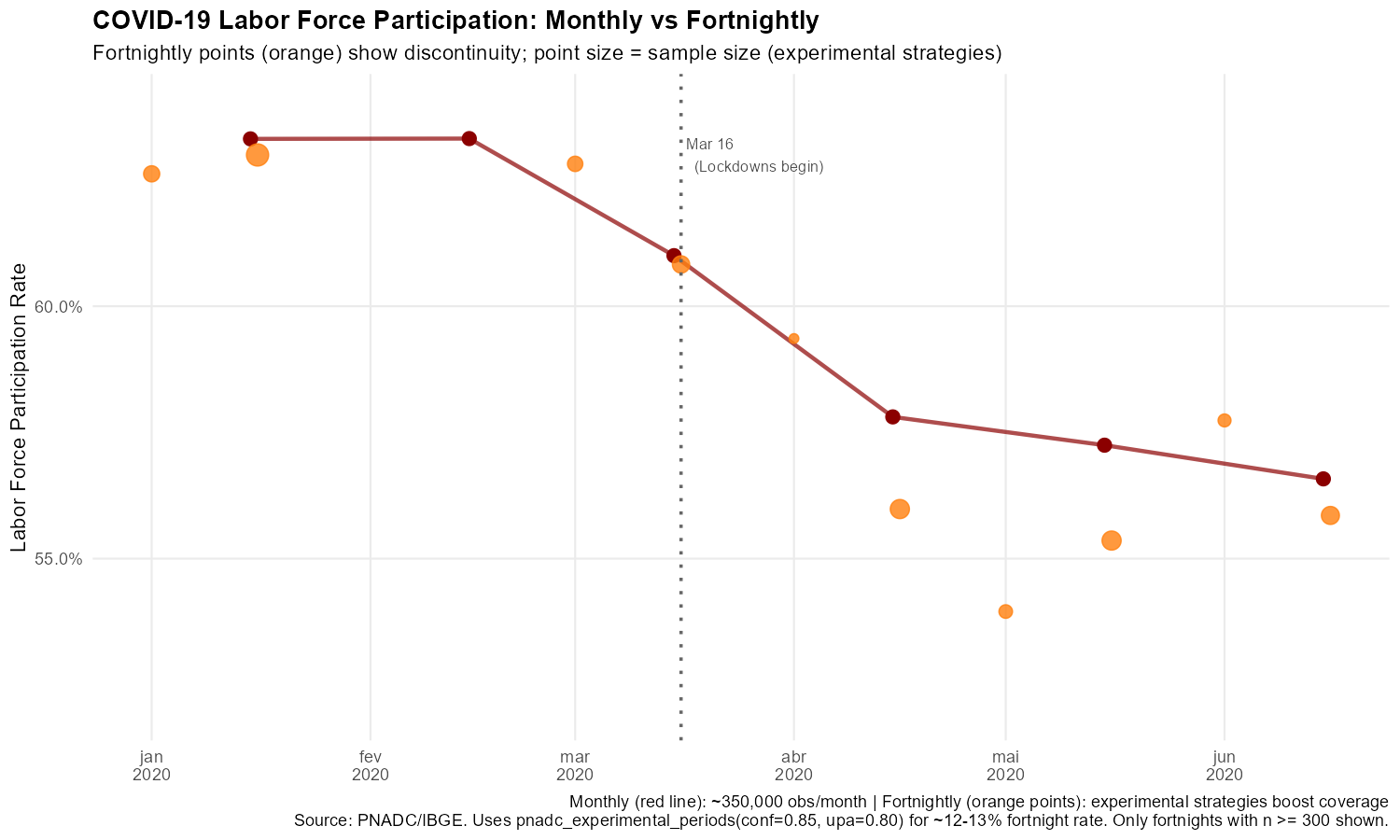
The fortnightly data shows a sharper discontinuity around March 16—the participation rate in the second fortnight of March dropped more steeply than the monthly average suggests.
Example: Carnival Week Labor Market Effects
Carnival is Brazil’s largest cultural event, concentrated in specific states (Bahia, Rio de Janeiro, Pernambuco). We pool multiple years (2019, 2022-2025, excluding COVID years) and compare Carnival states to other states, using average hours worked (VD4035):
# Filter to Q1 of Carnival years with calibrated weekly weights
carnival_years <- c(2019L, 2022L, 2023L, 2024L, 2025L)
pnadc_wk <- pnadc_weekly[
  !is.na(weight_weekly) & Trimestre == 1L & Ano %in% carnival_years &
  V2009 >= 14 & VD4002 == 1 & !is.na(VD4035)
]

# Define Carnival weeks (ISO week of Carnival Tuesday)
carnival_weeks <- data.table(
  Ano = carnival_years,
  carnival_iso_week = c(10L, 9L, 8L, 7L, 10L)
)

# Extract ISO week and merge
pnadc_wk[, iso_week := ref_week_yyyyww %% 100L]
pnadc_wk <- merge(pnadc_wk, carnival_weeks, by = "Ano", all.x = TRUE)
pnadc_wk[, is_carnival_week := (iso_week == carnival_iso_week)]

# Flag Carnival-intensive states (BA=29, RJ=33, PE=26)
pnadc_wk[, is_carnival_state := UF %in% c(29L, 33L, 26L)]

# Aggregate: average hours by Carnival week x region (pooled across years)
weekly_carnival <- pnadc_wk[, .(
  avg_hours_worked = sum(VD4035 * weight_weekly, na.rm = TRUE) /
                     sum(weight_weekly, na.rm = TRUE),
  n_obs = .N
), by = .(is_carnival_week, is_carnival_state)]
Show plotting code
ggplot(weekly_carnival,
       aes(x = fifelse(is_carnival_week, "Carnival Week", "Other Weeks"),
           y = avg_hours_worked,
           fill = fifelse(is_carnival_state, "Carnival States (BA/RJ/PE)", "Other States"))) +
  geom_col(position = position_dodge(width = 0.8), width = 0.7) +
  scale_y_continuous(limits = c(0, 45)) +
  scale_fill_manual(values = c("Carnival States (BA/RJ/PE)" = "#ff7f0e",
                               "Other States" = "#1f77b4")) +
  labs(
    title = "Average Hours Worked by Week Type and Region",
    subtitle = "Pooled data from Q1 2019, 2022-2025 (experimental strategies)",
    x = NULL, y = "Average Hours Worked (per week)",
    fill = "Region",
    caption = "Uses pnadc_experimental_periods(strategy='both', conf=0.85, upa=0.80). Pooled across 5 years."
  ) +
  theme_minimal(base_size = 11)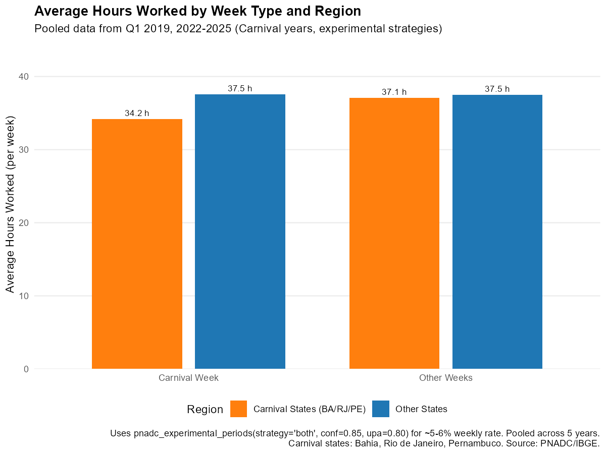
Workers in Carnival-intensive states reduce their average hours worked during Carnival week compared to other weeks, though the small weekly sample sizes mean estimates have considerable uncertainty.
See Also
- Get Started - Basic mensalization workflow
- How It Works - Algorithm details and technical explanation
- Annual Poverty Analysis - Monthly poverty analysis with annual income data
- Download and Prepare Data - Data download workflow
References
-
HECKSHER, Marcos; BARBOSA, Rogerio J. “Estimation of exact months for the microdata and rolling quarter series from PNAD Continua”. SocArXiv preprint, 2026. https://osf.io/preprints/socarxiv/fra5u_v1
Earlier formulations of the methodology:
- HECKSHER, Marcos. “Valor Impreciso por Mes Exato: Microdados e Indicadores Mensais Baseados na Pnad Continua”. IPEA - Nota Tecnica Disoc, n. 62. Brasilia, DF: IPEA, 2020. https://portalantigo.ipea.gov.br/portal/index.php?option=com_content&view=article&id=35453
- HECKSHER, M. “Cinco meses de perdas de empregos e simulacao de um incentivo a contratacoes”. IPEA - Nota Tecnica Disoc, n. 87. Brasilia, DF: IPEA, 2020.
- HECKSHER, Marcos. “Mercado de trabalho: A queda da segunda quinzena de marco, aprofundada em abril”. IPEA - Carta de Conjuntura, v. 47, p. 1-6, 2020.
NERI, Marcelo; HECKSHER, Marcos. “A Montanha-Russa da Pobreza”. FGV Social - Sumario Executivo. Rio de Janeiro: FGV, Junho/2022. https://www.cps.fgv.br/cps/bd/docs/MontanhaRussaDaPobreza_Neri_Hecksher_FGV_Social.pdf
NERI, Marcelo; HECKSHER, Marcos. “A montanha-russa da pobreza mensal e um programa social alternativo”. Revista NECAT, v. 11, n. 21, 2022.
IBGE. Pesquisa Nacional por Amostra de Domicilios Continua (PNADC). https://www.ibge.gov.br/estatisticas/sociais/trabalho/
Barbosa, Rogerio J; Hecksher, Marcos. (2026). PNADCperiods: Identify Reference Periods in Brazil’s PNADC Survey Data. R package version v0.1.2. https://CRAN.R-project.org/package=PNADCperiods